Audit & Mapping
Cataloged component drift across Material UI and custom-themed implementations.
Visual System
Updating a fragmented visual system to be AI ready.
Freight UI focused on consolidating a fragmented component ecosystem split across Material UI patterns and multiple custom themes into a unified, scalable design system.
The product experience lacked cohesion because teams were shipping from competing component patterns and theme implementations, creating inconsistency and higher implementation overhead.
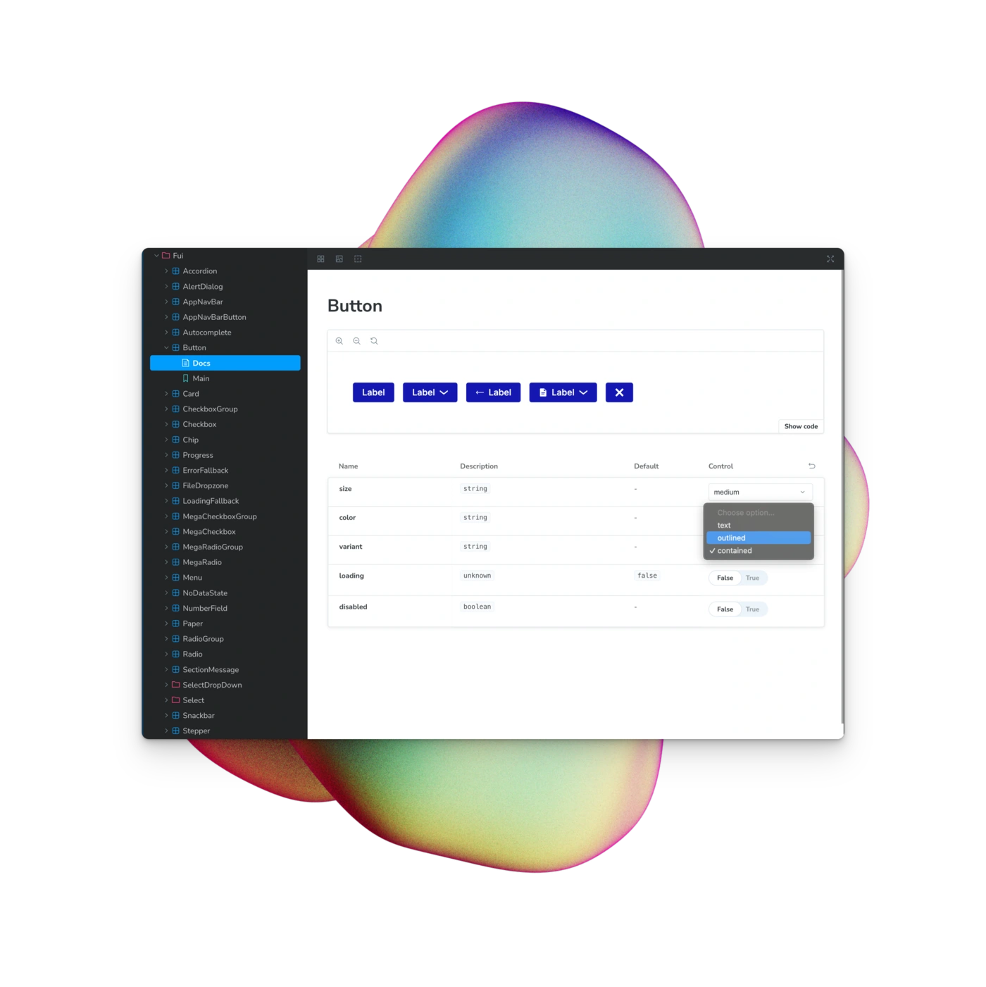
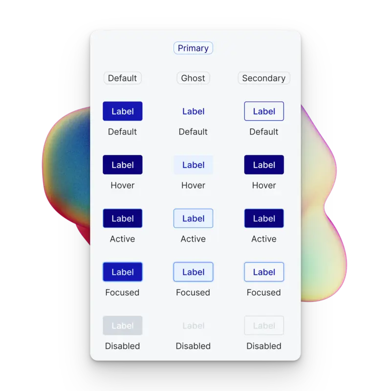
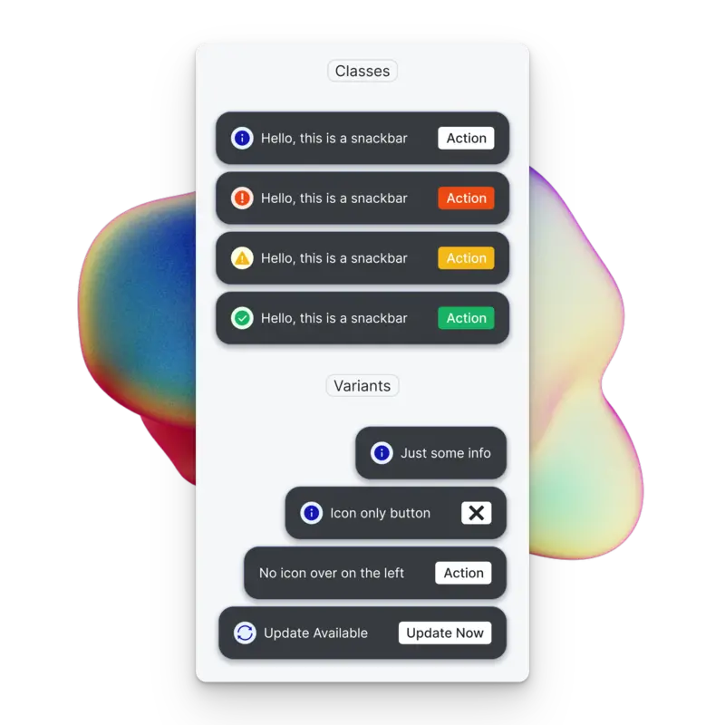
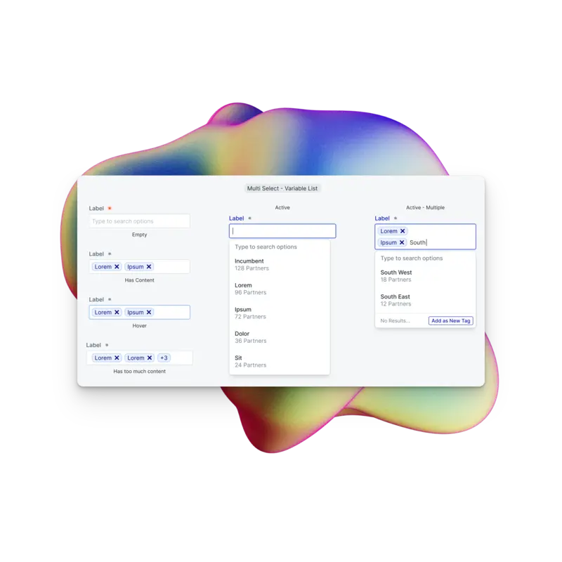
Designers, engineers, and AI agents all reference the same source of truth for component usage — eliminating ambiguity across every application. Developers can copy production-ready code directly from the tool and explore every available parameter. Each component maps 1:1 to its Figma counterpart, so there is never confusion about which component to use or what it should look like.
Audit & Mapping
Cataloged component drift across Material UI and custom-themed implementations.
System Modernization
Led redesign and standardization of shared components with implementation constraints in mind.
Documentation
Rolled out Storybook docs (storybook.emergemarket.dev) including FUI component stories to improve dev handoff and usage consistency.
Unified Component Standards
Core UI patterns were consolidated into a coherent cross-team component system.
Storybook-Driven Adoption
Design and engineering shared documented component behavior and usage guidance in Storybook.
Challenge
Fragmented implementation patterns made consistency difficult at scale.
Solution
Introduced shared component standards, documentation, and governance through Storybook.
Outcome
Improved UI cohesion and reduced ambiguity between design intent and engineering execution.
Gallery
If you liked this case study, check out this related project next.
Product LeadershipProcureOS Pro→